ABOUT THE PROJECT
Antelligence Escape is a third person action/adventure game developed in four weeks at Futuregames.
We had the requirements to make a survival game featuring an aquatic animal outside of its natural habitat.
• Role: Product Owner, Game & UX Designer, Visual Scripting
• Project length: 4 weeks
• Engine: Unreal Engine 4
• Genre: Survival Action/Adventure
• Team size: 6 people
(3 designers and 3 artists)
CONTRIBUTIONS
GAME & UX DESIGN
• Core gameplay loop
• Player mechanics
• Progression and onboarding
PRODUCT OWNER
• Conveying the team vision
• Keeping track of backlog
• Organizing playtest and feedback
VISUAL SCRIPTING
• Player mechanics
• UI elements
• Interactable objects
GAME DESIGN
In Antelligence Escape your goal is to escape a testing facility that is overrun with bionic animal experiments.
At your disposal you have your own bionic body, that you upgrade to gain new abilities as you fight your way out.
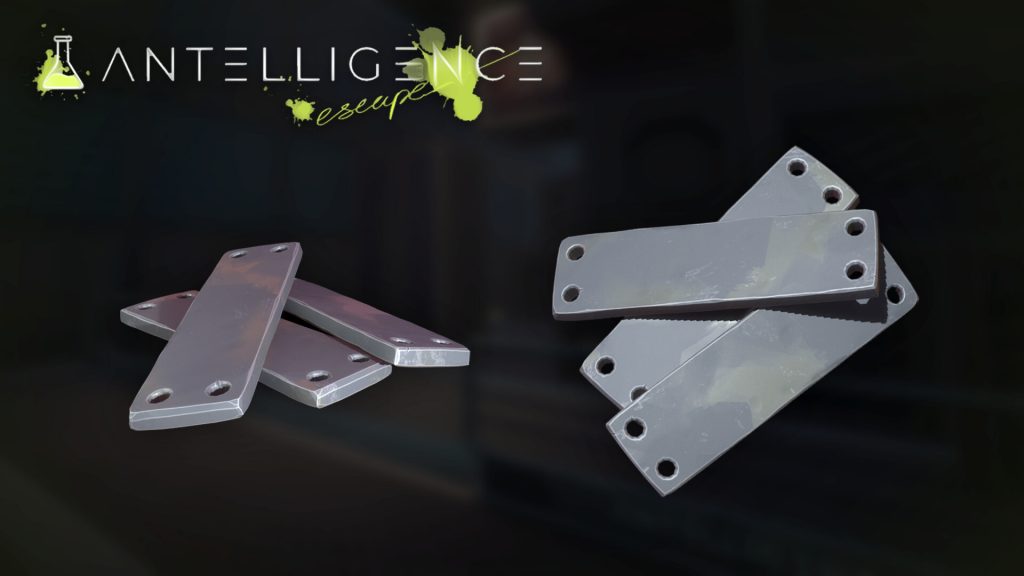
The core gameplay loop requires the player to gather scrap metal through looting chests or salvaging defeated enemies.
With the scrap metal the player crafts upgrades to their bionic body – allowing them to traverse new areas and perform new abilities. The player requires BioFluid to power their abilities, which is also gathered from defeated enemies.
Design Pillars

Upgrade

Combat

Survival
PLAYER MECHANICS
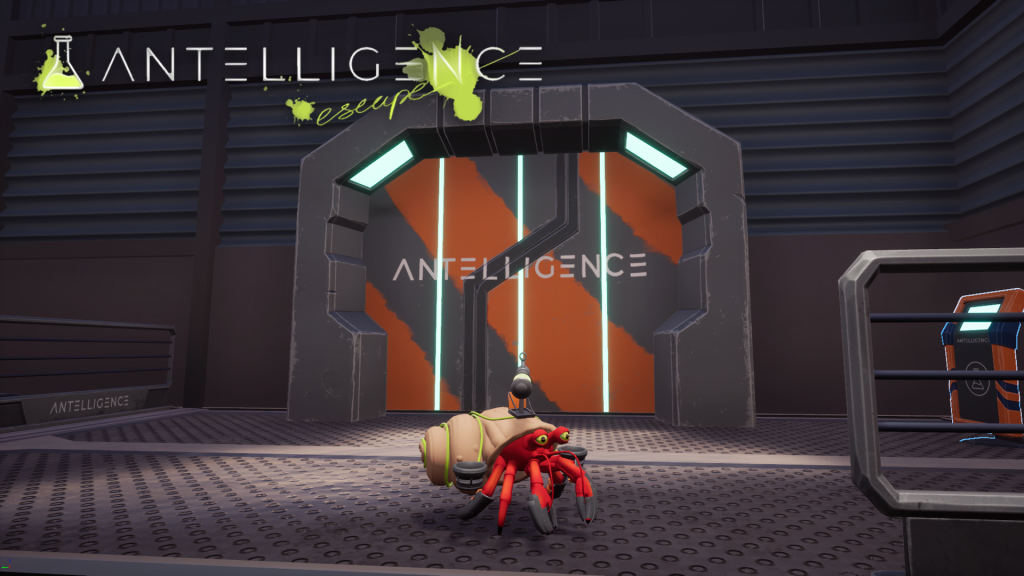
THE BIO-ENGINEERED HERMIT CRAB
We decided to have five player abilities that will be unlocked one by one during the course of the game. They all either offer some form of movement or survivability that will help the player fight their way out of the lab. Together they make a strong arsenal, where all abilities are quite different which we hope makes the player is excited about aquiring them. Our goal is to make the player feel empowered with each aquisition.
Claw
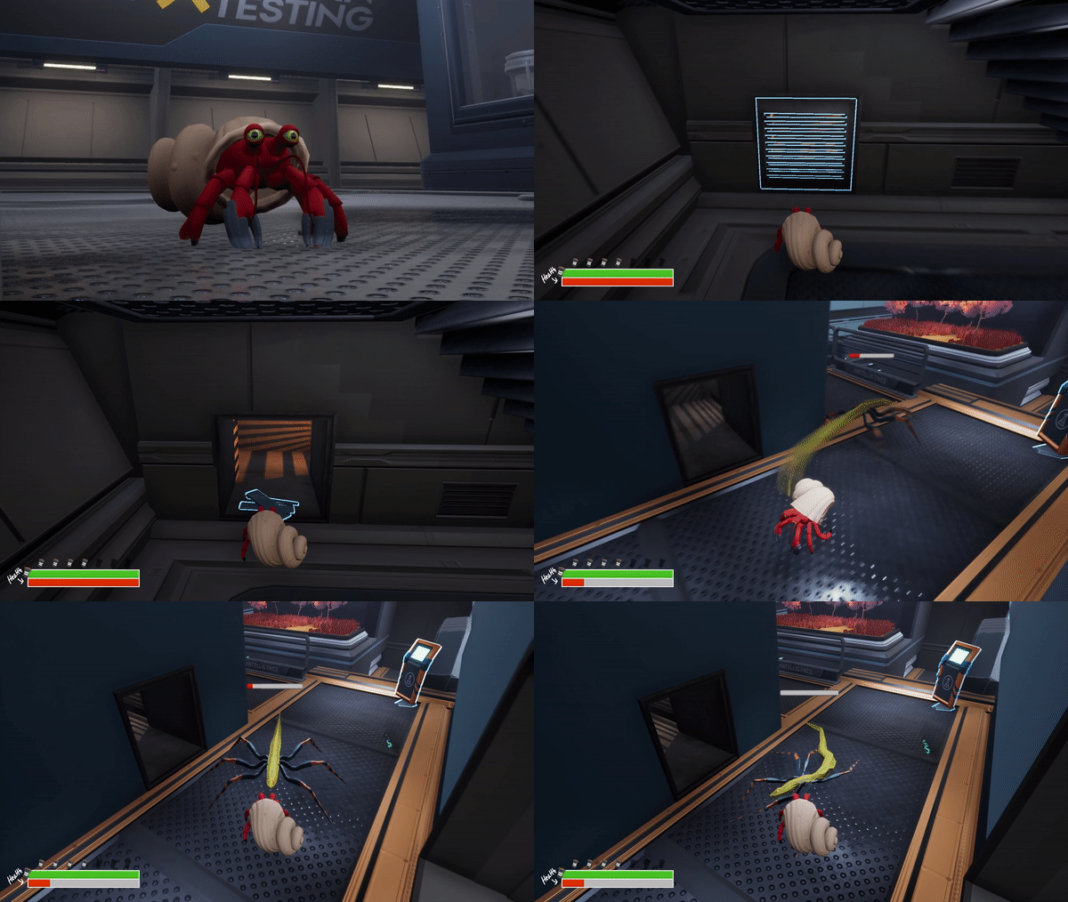
Since since killing enemies is the player’s primary way of finding scrap metal and BioFluid we decided to create a melee attack as the first upgrade. Not only does it give the player a chance to defend themselves against enemies, it also allows them to break ventilation grills and escape the facility through more interesting paths.
Regeneration
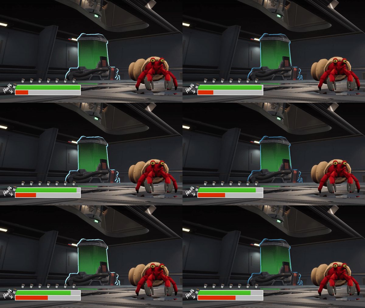
The player then gains the ability to regenerate their health by consuming BioFluid. The health will increase over time to maintain a sensation that the player still needs to be watchful, because enemies might still be able to kill them.
X
Dash
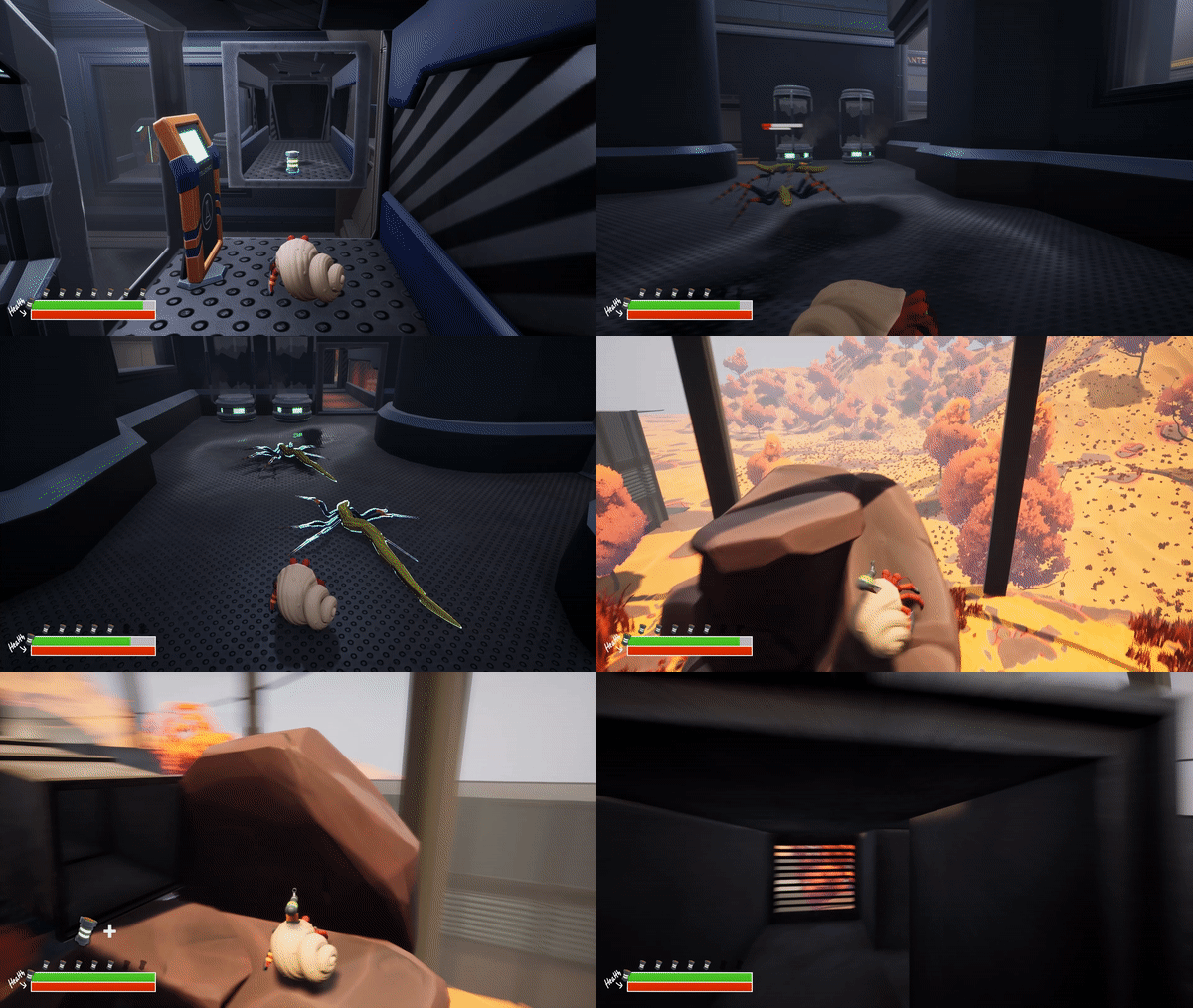
We decided to add a dash ability to give the player the option to quickly relocate themselves and turn the tide of battle. It also added possibilities for traversing new spaces through more interesting level design with elevation differences.
X
Turret Gun
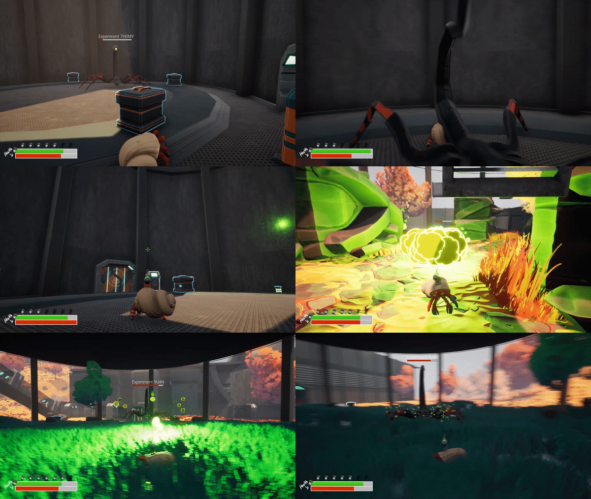
After defeating the first boss the player takes its gun ability into their own arsenal. This gives the player the ability to fight at range, which allowed us to make more challenging encounters with larger groups of enemies.
X
Jetpack/Body Slam
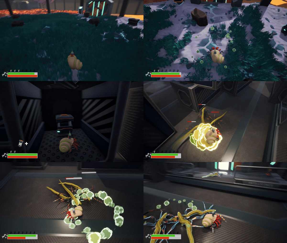
Defeating the second boss gives the player the ability to launch into the air, and they can then slam their body into the ground. This gives the player more traversal options and the ability to temporarily avoid melee attacks from enemies, while also giving them the option to retaliate with area-of-effect damage.
UX DESIGN
The user’s experience was considered in all aspects of the game’s design, so everything can not be covered in this section. In general, I wanted to ensure that we worked together towards a coherent game world, so I was communicating regularly with all team members to make sure we stayed true to the vision. The game should express a feeling that the hermit crab was out of place, in a hostile environment. We thought that a metal construction in a desert landscape with eels, the hermit crabs natural predator, accompanied by an ominous ambience sealed the deal.
Readability/Guidance
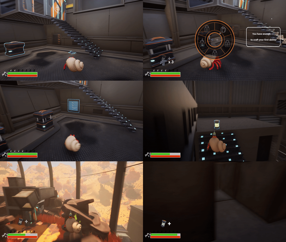
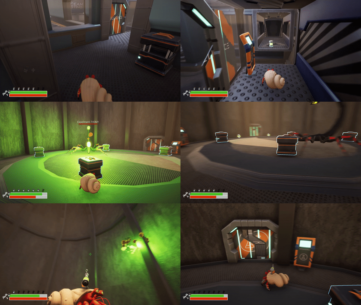
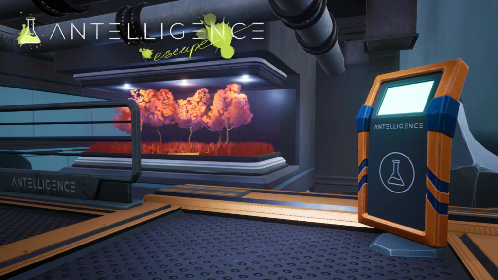
In order to not confuse the player about what they can do in the game I made all interactable objects highlighted with a soft blue outline. It might also make the player realize what objects they can’t interact with, which provides clarity and prevents them from becoming frustrated.
Remaining consistent with the use of highlighted objects helps guide the player forwards as they play, since obtaining loot is a strong motivator which was used in the level design to provide clear points of interest.
Visual Progression
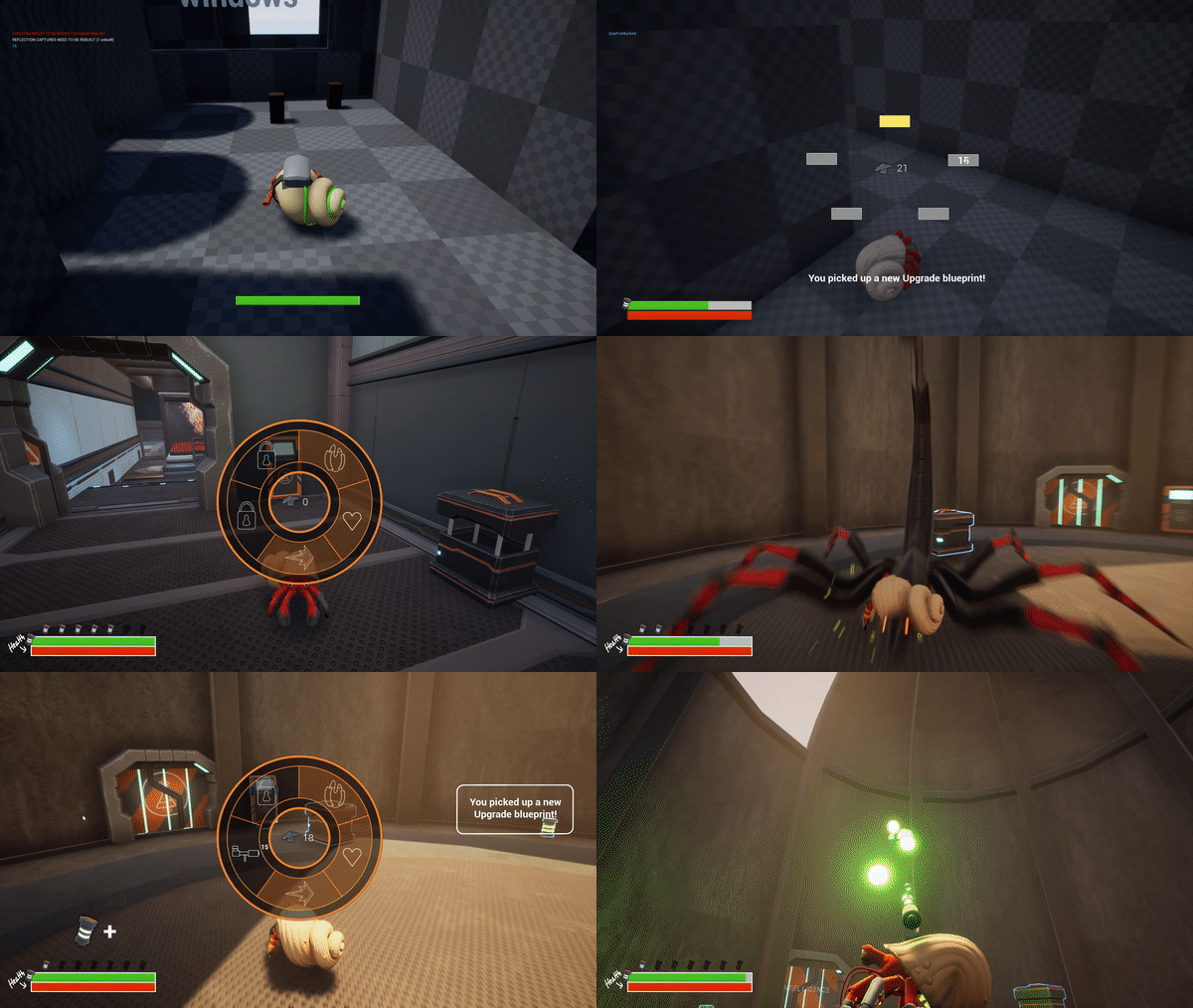
I wanted a way to visualize the player’s progression. By iterating on the player’s ability wheel I wanted to provide a visual progression system that the player could use to evaluate their current strength. My goal with the system is to entice the player to progress by letting them see how far they have come. Then the player could look forward to facing new enemies for the chance of obtaining their next upgrade, like a hermit crab constantly on the lookout for a better shell.
Onboarding
When the player received new abilities I wanted to give them safe spaces where they could craft and practice that ability without penalties, like a tutorial that did not interrupt the game’s flow. The player could then continue when they felt like it and proceed to use that ability in combat. I worked closely together with the level designer to ensure that the player learned to walk before needing to sprint, aim before needing to shoot, and jump before needing to dunk.
Foreshadowing
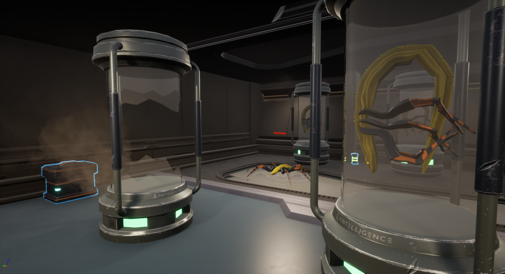
In the introductory part of the game we wanted to prepare the player for what kind of enemies they would be facing, so we implemented aspects of environmental storytelling to foreshadow the first encounter, and to make the player conscious of what had escaped from the tubes.
First, the player sees testing tubes with enemies in them, and shortly after they see smashed tubes. By visualizing smashed tubes we warn the player that enemies are lurking nearby.
Shapes
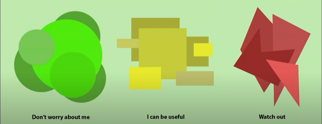
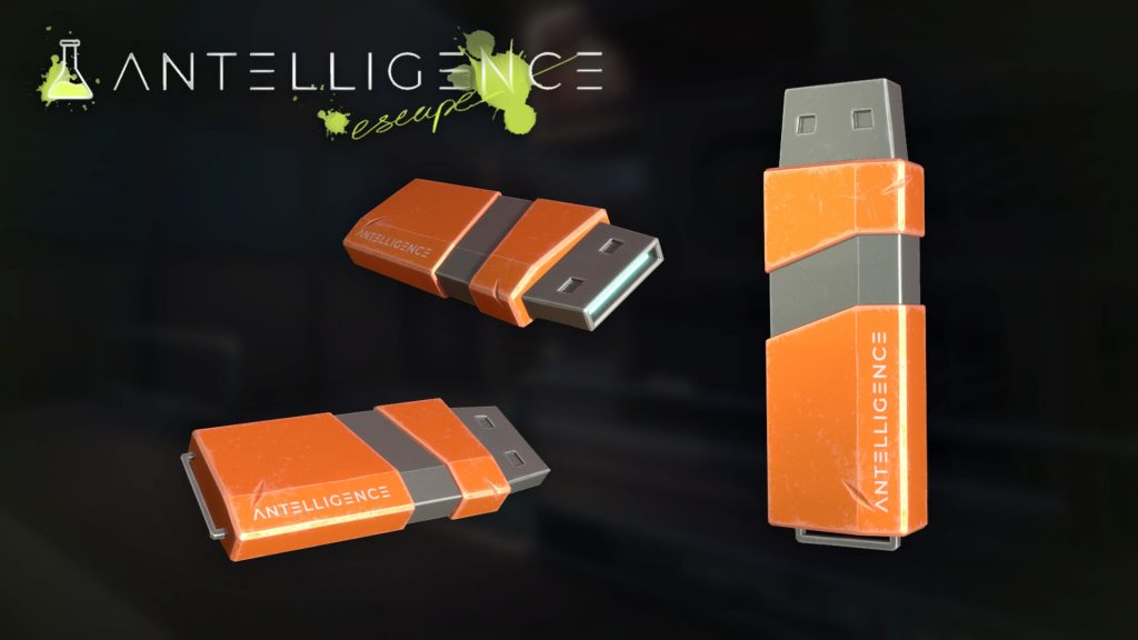
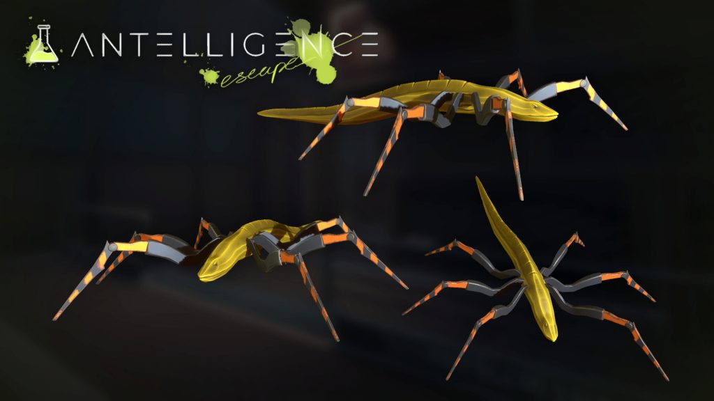
By using the affordances of primitive shapes we wanted to give the player an understanding of the objects and actors around them that required a very small cognitive load. The player character has round shapes, which evokes safety and wellbeing – something the player will care for. Most pickups are rectangular, which suggests power and stability – which can be uselful for the player. The enemy eels are pointy and sharp, which evokes danger – a threat to the player.
PROGRESSION
LOOKING FOR A BETTER SHELL
We wanted to emphasize the natural behavior of hermit crabs, with them always looking to upgrade their shells. In the same way we wanted the player to feel that they aquired more strength with new abilites as the game progressed. The bionic bodies encourage scavenging parts from other creatures, and letting the player craft those onto their own shell enforces an evolutionary progression.

Level 1 focuses on introducing the player to the core gameplay loop. Here they have time to get accustomed to their surroundings, discover new abilities and explore the lab while encountering small amounts of enemies.
Level 2 starts with a boss encounter that requires the player to use the abilities they have discovered. More and more enemies will start to appear in the player’s path so the player will get familiarized with using their skills.
Level 3 is where the player shows off their skills in new ways as they traverse different paths to escape the facility. After the final boss is defeated the player needs to survive a horde of enemies that appear as they reach the end door.
BioFluid
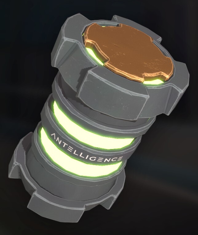
To facilitate an engaging survival experience I thought it was important to integrate meaningful choices for the player to choose between as they play. Therefore, a main resource was connected as a vital ingredient for the player’s actions – BioFluid. The green BioFluid can be used to trigger both offensive and defensive powers, so the player needs to use it wisely. BioFluid is the source of all the player’s abilities and without it they can’t do anything extraordinary!
Without BioFluid – the player is just controlling an ordinary hermit crab.
Originally, the player was only supposed to be able to have one ability activated at a time. However, that went against the nature of the hermit crab always looking for shell upgrades. It was therefore decided that the player retained an ability once it was crafted and could thus utilize their arsenal more effectively, since the final version improved the flow of the game by removing a lot of unnecessary menu openings. The player could then operate quicker, which might result in them feeling like they have control during their encounters.
PRODUCT OWNER
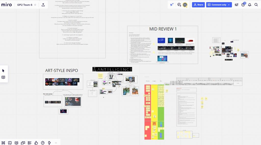
As product owner I made sure to establish a clear vision for the game and conveyed it to the team. I structured my own kanban board for tracking the process of the project in Miro and formed a backlog with the game’s requirements that was updated regularly.
I communicated with all team members and delegated tasks whenever someone finished what they were doing. In order to keep the backlog up to date I needed to do a lot of playtesting, so that I could add and remove tickets for bugs. I organized the feedback we received from external playtesters and actively worked to implement the relevant information into the many iterations that were processed during the course of the project.
LEVEL & WORLD DESIGN
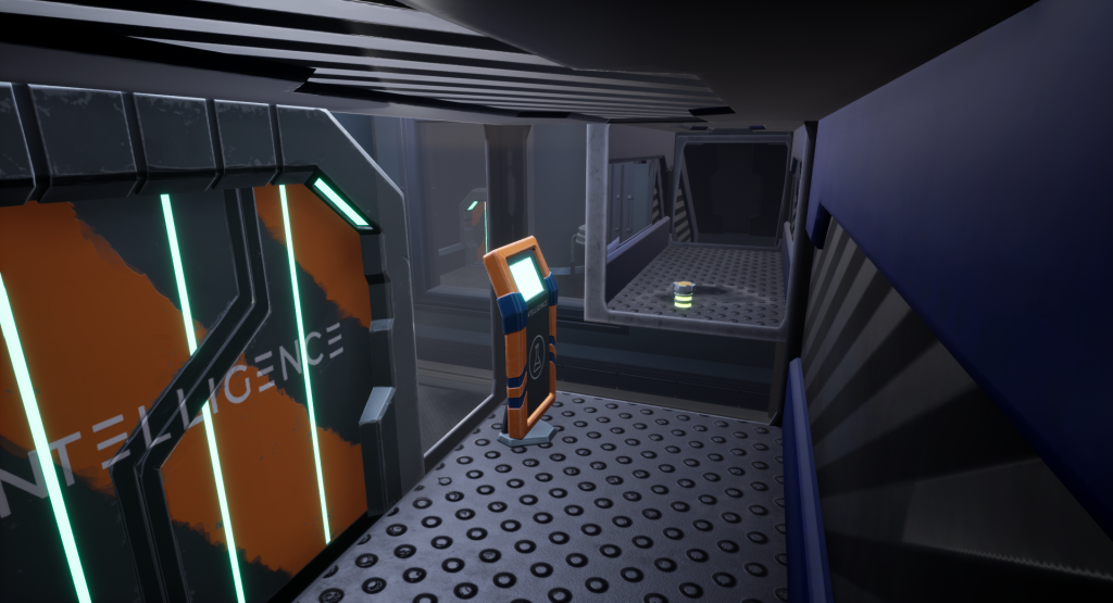
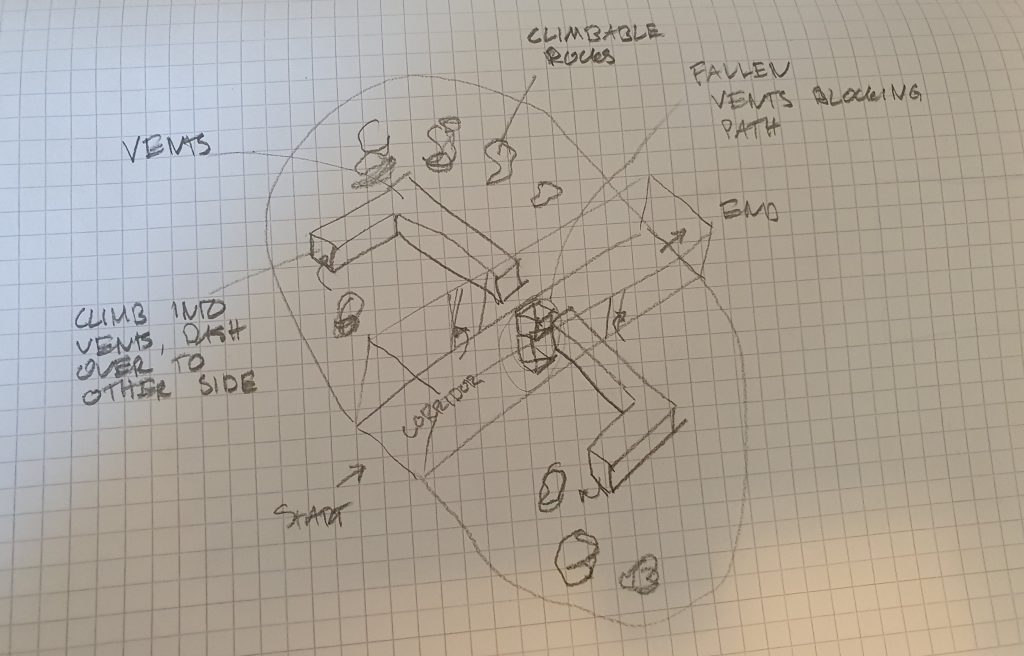
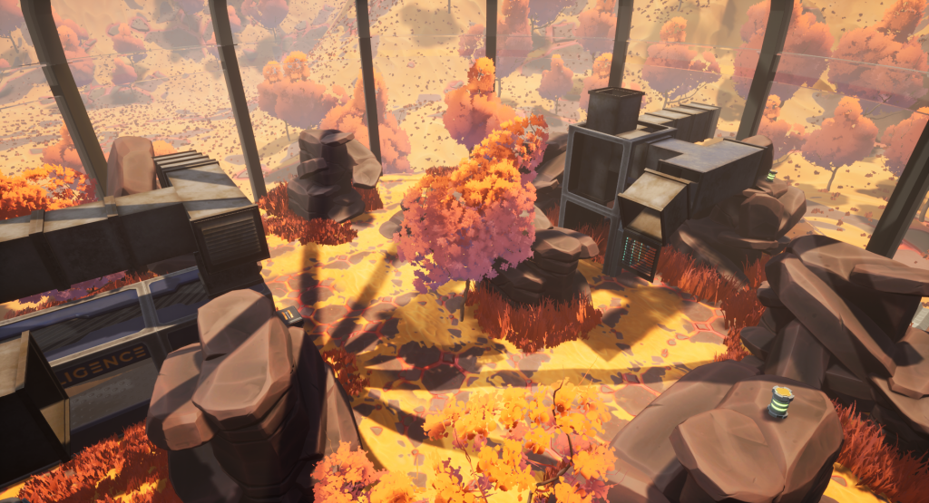
I helped the level designer make it so that the player learns the game while they play, and also provided the concept for the habitat level of the game. As an example, we wanted the player to master the dash ability so we set up a parkour level with rock formations the player needs to climb and dash accross to reach the vents at the other side of the room. This was due to the player needing to face the final boss after this room, which requires usage of the dash in order to dodge a body slam mechanic.
Longing for freedom
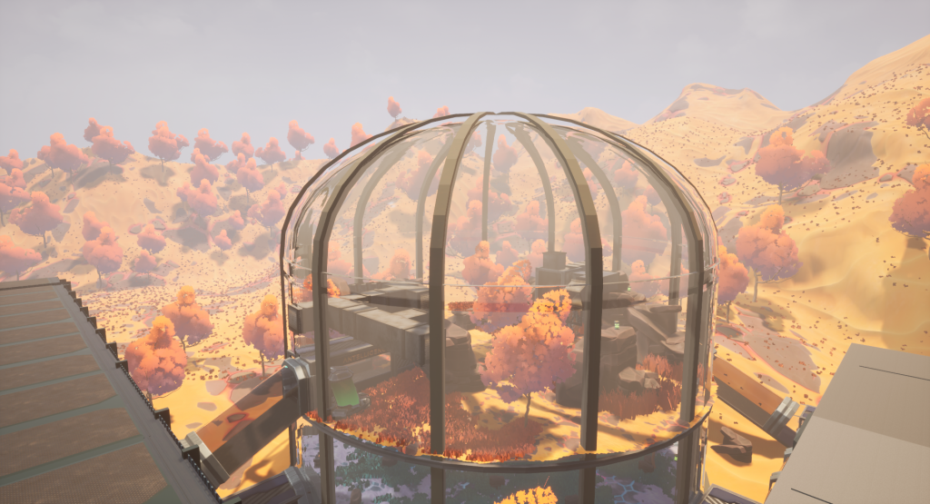
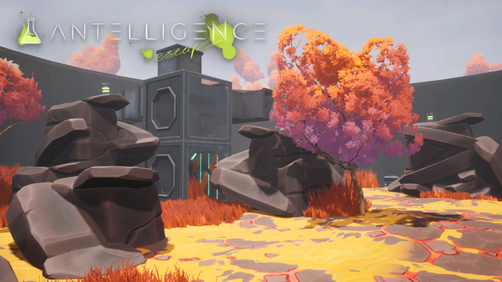
While the gameplay is confined to the inside of the facility we thought the landscape design was an important factor to incoorporate, in order to frame the scene. Since the goal of the game is to escape the facility I wanted the player to be able to see and long for the outside they were chasing. Many windows were added to the open areas, which nicely contrasted the darker narrow vents and passages.
When the player looks outside we want them to see an exciting landscape that reflects the habitats of the experiments, showing their natural habitat outside and their freedom beyond the metallic construction.
VISUAL SCRIPTING
I was responsible for a lot of the visual scripting in the game. Therefore, I made sure that my blueprints were well commented and easily readable by others, in case there would be others whose work could overlap with mine. The blueprints I created included all of the player’s mechanics, the animation blueprints, the ability wheel, UI elements, the interactable objects and more.
Player Mechanics
I scripted all of the player mechanics, and my main focus was to make sure they felt exciting to use by giving the player powerful feedback. An example is the Jetpack/Slam Dunk ability, that required a lot of tweaking to feel just right. As the player launches into the air they are accompanied by both particle and sound effects, and as they reactivate the ability to Slam Dunk their input is immediately rewarded with new effects and a screen shake upon impact.
The player is incentivized to use the mechanic since it provides both an alternative traversal method and a powerful move in combat.
Ability Wheel & UI
Scripting the ability system required several iterations. To craft abilities, the player needs to pick up an upgrade blueprint and have the required amount of scrap metal. At first, each step required it’s own click. First you unlocked the ability, then you crafted it, and finally you equipped it. I decided to improve the quality of life for the player by reducing the amount of clicks required to just one.
I also scripted all the other widgets, including Health and BioFluid meters, menus and pop-ups.
Interactable Objects & Animations
Finally, among the other things I scripted was all the interactable objects such as chests and doors, as well as item pickups and the highlights that outline them. I wanted it to be easily readable when an item was picked up so I made sure every action had its equal opposite reaction either through audio, visuals, or both. I also implemented the animation blueprints and made sure the actions for both the player and the AI registered correctly. Getting the attack states right required a lot of bugfixes, since collisions and traces were tricky to get right.
CLOSING THOUGHTS
This project taught me a lot as I got to put many UX theories into practice while also developing my gameplay design skills. I am very proud of what my team and I were able to accomplish in this short amount of time, and I would love to see how far we could have taken this if we had more time. Personally I would have liked to focus more on improving the UI pop-ups and balancing the amount of scrap metal received throughout the game (since the player was stacked with metal towards the end). However, it was a very ambitious project that I highly appreciated so I am definitely happy with the end result!
TEAM MEMBERS
GAME DESIGNERS
• Per Hallros
• Chris Karlsson
• Felipe Fleming
3D ARTISTS
• Hugo Svedstam
• Joji Santhosh
• Isabelle Hydén
Thank you for reaching all the way down here, I hope it was insightful!


