
Click here for access to the Figma project file.
ABOUT THE PROJECT
This Futuregames project allowed us to analyze and suggest UI improvements for any game of our choosing.
I chose Generation Zero (2018) by Avalanche Studios Group.
• Role: UX Designer
• Project Length: < 1 week
• Software: Figma
• Team Size: 1 (solo)
THEME
The game is set in an apocalyptic scenario in a Swedish archipelago during the 1980s, and the game’s UI has a theme that represents the characteristics of the Swedish military during that time.
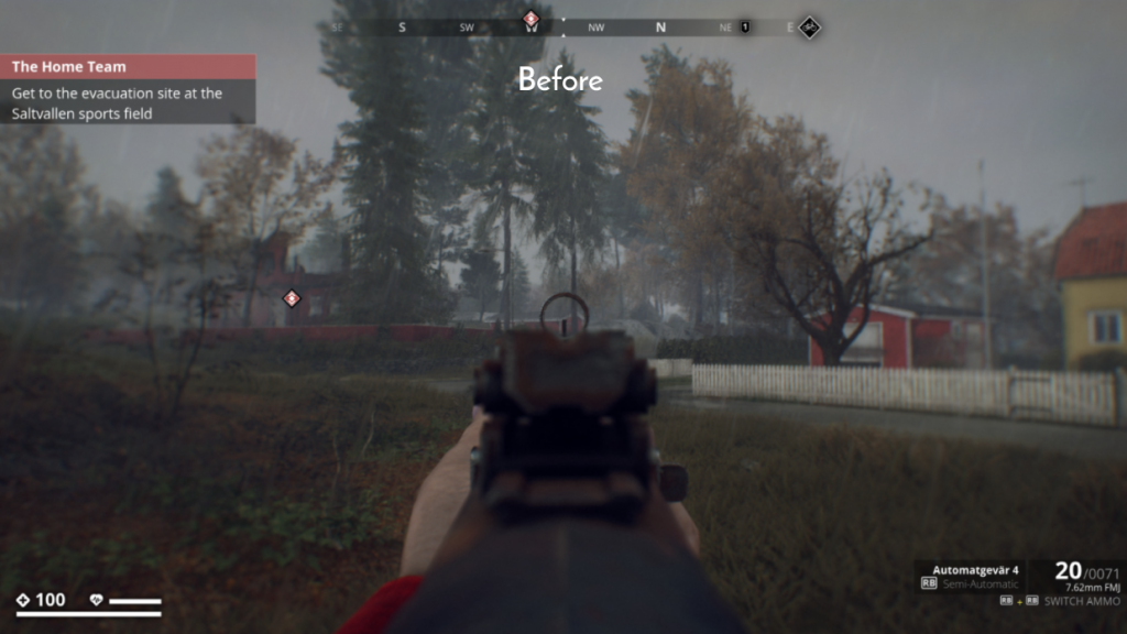
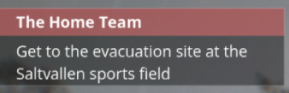
Before
When considering that most players might not even have been born during the 1980s it is likely that they are unfamiliar with the Swedish military style of that time. This results in the UI feeling sterile and blocky in the relation to the events of the game. To me, the UI does a poor job of reinforcing either a 1980’s feeling or an apocalyptic setting to someone who is unfamiliar with the realistic references.
After
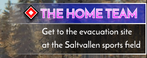
Since most players don’t know what’s real another approach can be taken to create a more immersive experience; using stereotypes. To the unknowing players the stereotypes will be more true to their understanding of the 1980s era than reality. To them, the stereotypes are familiar and thus more true to the player’s reality. Therefore, the entire theme of the UI was revamped to a more stereotypical 1980s look.
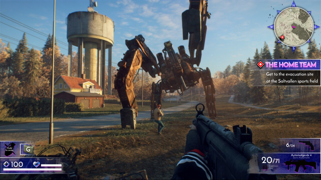
I removed the gray background boxes and replaced them with neon purple gradients. Objective headers were updated with a more vibrant color theme and my added icons were given a bright pink shadow. Behind all UI elements I also placed specks of dirt, to create an understanding of the unsanitary conditions of the apocalypic setting.
NAVIGATION
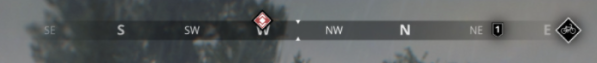
Before
The original navigation bar at the top of the screen serves as a compass with objective markers displayed on it. However, it doesn’t readily promote a simple means of navigation since the player won’t see any objective icon unless they are already facing in the right direction. A flat compass used this way also requires a large cognitive load to read by the players since they need to manually remember where they are in relation to their goal. In multiplayer this issue is more noticeable, since you can’t confidently rotate rapidly to the direction your teammate tells you if you’re not sure about your current rotation.
After
Returning the compass to a round shape with an added minimap directly displays the player’s rotation in relation to the compass coordinates. This will greatly improve the navigational aspects since the compass coordinates will always be fixed on the screen and their values won’t be relative. When the player then moves it will only the player’s icon that rotates. Having the objective marker always be displayed on the minimap regardless of the player’s direction will also improve the player guidance.
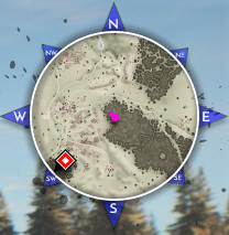
I added the objective’s icon to the objective’s description to enchance the player’s cognitive perception of similarity. The same icons enforce an understanding that the objective’s icon on the minimap displays the direction of their current objective.
WEAPON INFORMATION
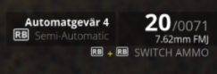
Before
The currently selected weapon’s information is displayed in the lower right corner of the screen. While it tells the player what weapon they are using, the player still needs to remember what kind of weapon a “Semi-Automatic Automatgenvär 4” is as they swap to it. This can be troublesome when a massive robotic monster is rushing towards you and you need to adapt on the fly. In that case it would be better if you could understand the functionality of your selected weapon with only a quick glance.
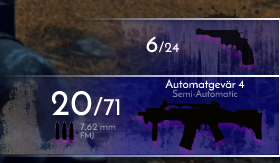
After
Instead of only seeing text and needing to read it to understand what your weapon does I added a preview of what the weapon looks like to the display. This will more likely give the player a faster understanding of which weapon they have selected and what it does, without them needing to read any text. In this case, the functionality is more important than the information. The ammunition is also more clearly displayed with icons alongside the text. In a smaller window above I display the player’s secondary weapon or their sidearm, to preemptively show what weapon will appear if they swap.
UTILITY ITEMS
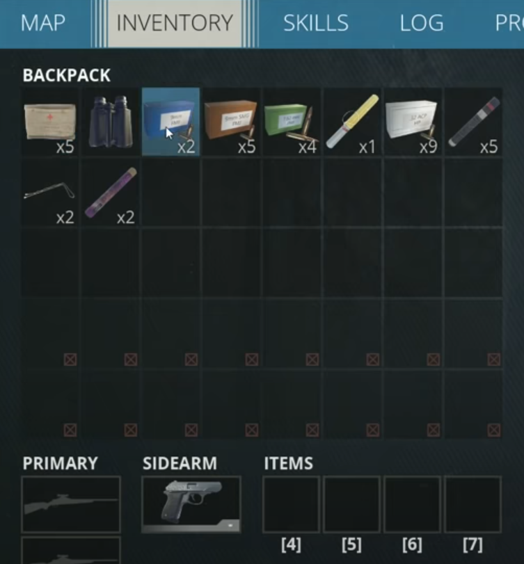
Before
The game currently requires you to handle utility items through inventory menu, where you assign the items you want to use to shortcut slots. Doing this requires many steps, which is an inconvenience for two reasons; it takes a long time and you are a vulnerable target while you set up your choices. Furthermore, the shortcut slots are not displayed on the HUD when you close the inventory menu which requires a high congitive load since you need to remember which items you equipped in which slot.
If a combat scenario requires you to use an item that is not allocated to a shortcut slot you will thus be in trouble, and it can be immersion-breaking to open a fullscreen menu just to sort out a quick access item.
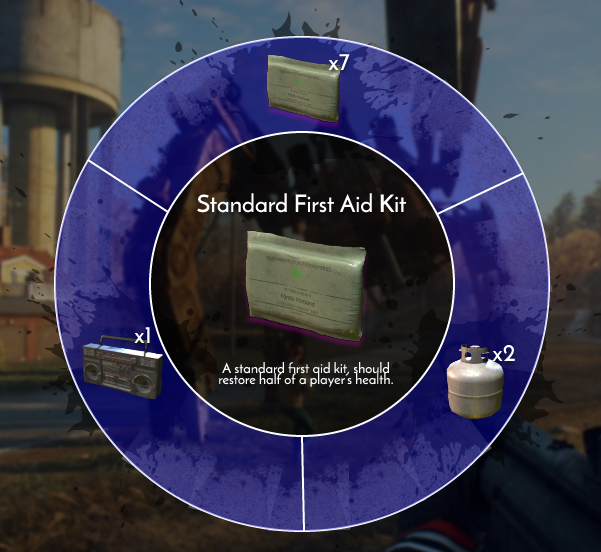
After
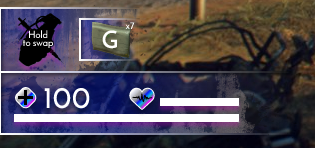
I added a utility wheel as a way to conveniently have access to all your utility items at once. Grenades, flares, medkits, etc. are directly equippable via the HUD by holding a single button and then selecting your choice with the mouse. Clicking that same button once lets you use the item without needing to stop the action. The more items the player picks up the more options they have when they open the wheel. Hovering an item displays all its relevant information. The amount indicators in the corners of the items also lets the player know when they have ran out of an item.
CLOSING THOUGHTS
While this was a relatively short project it was very enjoyable. I spent a lot of time on analyzing the features of Generation Zero’s UI which gave me great insight into what information different UI elements actually give to players. I will not say that my changes are actual improvements since they all have their own flaws, but I’m pleased with the look and feel I was able to create and I think it goes well in line with the game’s desired setting.
I hope you enjoyed reading about this project, thank you!